How I fixed The Crypts of Severus
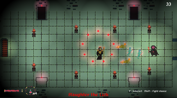
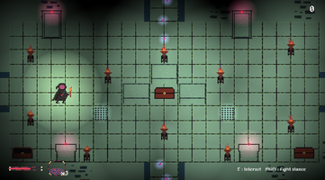
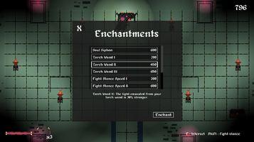
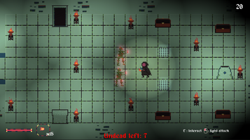
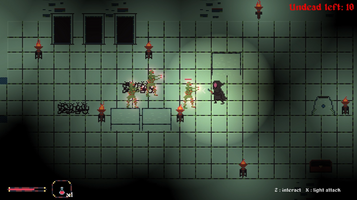
This past May, I participated in Illinois State University's weeklong summer game jam for 2023. Intent on always shooting for a high score in the jam, I thought this might be the jam where I finally make a game worthy of having a top spot in the rankings. Much to my dismay, the game didn't quite hit the mark in all the ways I thought it would. While this jam certainly proved I had gained skill in my art ability, there were a few comments I heard the most from play testers, being that the controls felt clunky and that there wasn't enough content. So, for the rest of the summer, I decided to improve the game's design best I could, so that these specific points were no longer an issue in gameplay.
The first concern was the controls. Taking inspiration from Pico 8 games I played, I had opted to use arrow key movement, with z, x and c being the interact controls. This obviously proved to be not the best solution, as it wasn't a traditional control scheme with most Unity games, or for most types of web game for that matter. I decided to switch it to WASD and mouse controls, which proved to be a much better solution that people were able to pick up quickly, provided they had the games literacy and experience. I also completely scrapped the option to press space to toggle through items in the game which was also a greatly needed change. I think I took inspiration for that from Castle Crashers, but realized that even for that game, it wasn't such a great system for inventory management (It was quite frustrating looking back on it). I instead opted for a player to have a weapon/item wheel that they could pull up by holding the space key, similar to the old assassin's creed games. While it took more work to implement, it felt so much cleaner and don't know why I didn't implement that in the first place.
Second thing to fix was the lack of content. There was only one measly little level for players to experiment with. I had originally intended for there to be three levels, but as a solo dev working on the project, there just wasn't enough time to implement all three before the deadline. So initially, I decided that I was going to just simply implement the levels I had drawn up. Issue fixed, right? But, as my brain got to churning, I sort of felt that just adding more levels wasn't enough for the game to be fun. Because of this. I thought that the player needed some way to feel more of a sense of progression. The gameplay elements were pretty quick to master, so I thought of two options in either tweaking the core gameplay to be more skill based or to introduce a perk system. In the end, I decided to go with the perk system, as a skill gap would've required a player to make a time investment to get better, and seeing as it was a web game, most players wouldn't want to make that time investment anyway. The perk system (enchantment system) ended up being made and accessible by collecting soul shards, which were collected from killing enemies or finding collectibles scattered across the levels. Overall, while a little formulaic and typical of a lot of other games, the enchantment system ended up being a nice addition that was a lot of fun for me to make.
Continuing on the tangent of adding more content, it was also very clear from play testers' comments that having just one enemy type was very boring. You'd think I would intuitively know that but for some reason, I just had never thought to add more enemy types in the first iteration of the game. But yes, the play testers were ultimately right, just having zombies as the only enemy was very repetitive. So, I went and added 3 new enemies that I thought came out very well. The crawler, in essence, is the same as a zombie but is faster and has less health. These guys were a fun addition as I could spam lots of them in pockets of the level and players would have to strategize how to kill them all in groups to manage their resources. The ghosts are enemies that can phase through walls have a unique attack pattern where they dash at you within a certain range. Also, I decided to make them only damaged by melee attacks, to add some variability in the gameplay, so that a player wasn't exclusively using fireballs and runes to clear out large groups of enemies. The last enemy I added was the lich, which was added as a boss fight in the final level of the game. The lich would march toward you, and every couple of seconds, unleash a spell from his staff that release damaging orbs in all different directions. While ultimately a simple attack pattern, it paired very nicely when also being forced to fight crawlers and ghosts that the lich would summon periodically. All these enemies were surprisingly very easy to implement too, as they were just offshoots of the original zombie I had made, so a lot of the same systems I already developed could be used. I think the varying enemy types were probably the most important change I needed to make, so I'm glad that they came out the way they did.
There were plenty of other changes I made in the improved version, but I wanted to at least highlight some of these in a devlog. The process of refining this project was an incredibly insightful experience, and I learned a ton about what makes a game feel more fun. It's bound to make a significant impact on my future projects. If you played the game, thanks for giving it a try! I hope you enjoyed this devlog too!
-lax919(Jake Ozer)
Leave a comment
Log in with itch.io to leave a comment.